This project focused on creating a balance between visual elegance and usability for a bridal boutique website. Research revealed that users often feel overwhelmed by too many dress options, unclear pricing, and complex booking processes. To address this, the design prioritized clear navigation, simplified filtering, and a streamlined booking experience, while maintaining an aesthetically pleasing interface. The result is a user-friendly platform that helps users easily browse options, build trust through real bridal content, and confidently move toward booking an appointment.
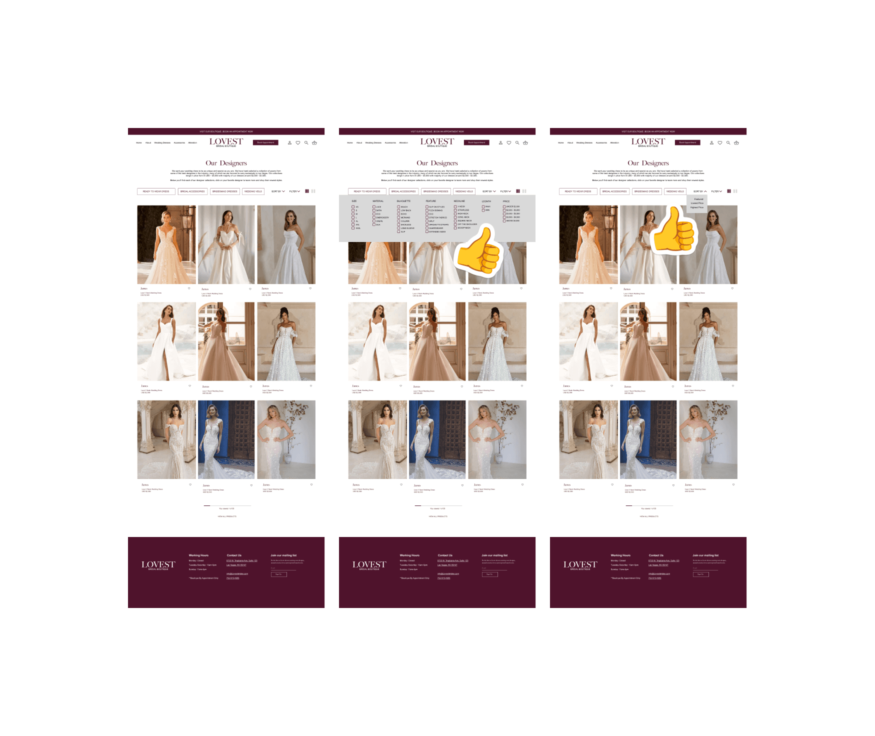
In addition to improving the filter functionality, I introduced sorting options such as price (high to low)
and expanded filtering criteria to include size, material, neckline, and other relevant attributes.
I also added category-based navigation to help users quickly access items they may be interested in.
For example, categories like “Ready-to-Wear” (for customers with urgent needs), accessories, and bridesmaid
collections direct users to dedicated pages, improving overall discoverability and browsing efficiency.
To improve efficiency, I consolidated the translation flow into a single screen,
allowing users to view results instantly without extra steps. For deeper learning, users can tap the
arrow to access additional information such as definitions and context.
Revisions and Next Steps
Based on the feedback, I prioritized improving the filter functionality by making it more detailed and intuitive.
Revisions were guided by key insights from evaluative research, focusing on the highest-impact usability issues.
Designer dress filters lacked clarity. Although users were able to successfully navigate to the designer dress page, they struggled to understand how to apply filters and access detailed information.

Positive results
Gallery images were large, visually appealing, and easy to locate, generating positive emotional responses.
However, one user expected the images to link directly to the boutique’s Instagram page.
Overall, users provided positive feedback on the experience. The navigation structure was clear, allowing users to quickly
understand the website and move between key pages. The booking flow was straightforward and easy to complete,
and the prominent call-to-action at the top of the page made it easy for users to identify where to book.
I designed the booking flow to be as simple and streamlined as possible, minimizing the number of steps and form
inputs to reduce user friction. Since users often feel overwhelmed by long or complex booking processes,
keeping it short and intuitive helps improve completion rates. On the confirmation page, I provided all essential details—
such as the appointment time, date, location, what to expect, and a map—so users feel informed and reassured after booking.
Prototype and Usability Testing
This test was to evaluate how easily users could navigate the bridal boutique website wireframes and complete key
tasks including browsing designer dresses, viewing the real bride gallery, learning about the boutique and booking an appointment.
Participants were asked to complete a series of tasks.

I placed a clear “Book Now” CTA
at the top of every page to make it
highly visible and easy to access.
After speaking with the owner,
it was clear that the main goal is to
drive appointments and bring
customers into the store, so
prioritizing this action at the very
top helps support that objective.
High fidelity UI
I tested my low-fidelity wireframes with users to evaluate both the product concept and overall design.
Based on their feedback, I iterated on the translate page multiple times, refining the experience through each round.
This collaborative process helped guide design decisions and ultimately led to the final high-fidelity UI.

Creating brand identity and visual style
Although the owner already has an established brand for the shop, I wanted to explore an alternative direction as a potential future update.
For this project, I chose to use a concept I developed—one that is simple, elegant, and well-suited to the wedding industry.
After establishing a solid foundation for the high-fidelity designs, I conducted usability testing on my low-fidelity wireframes to evaluate the overall product experience. I assigned participants a set of key tasks, including exploring the homepage, locating a specific designer collection, browsing and filtering dresses, booking an appointment, viewing the real bride gallery, and finding store information. These tasks were designed to reflect core user goals and assess the clarity, usability, and flow of the design.
From the lo-fi wireframes test, a few clear patterns stood out. While the overall flow made sense once explained, people initially felt a bit lost due to the lack of a visible navigation bar. When browsing dresses, users liked the layout but wanted filters—especially price—right away so they could narrow things down faster. The booking process felt easy to complete, but users were unsure about details like appointment length and confirmation. One thing that worked really well was the real bride gallery—everyone liked it because it felt more authentic and trustworthy. Overall, making things clearer, more transparent, and easier to navigate would help users feel more confident throughout the experience.
After selecting a key focus area, I defined a set of features, prioritizing those that are essential to the core experience while identifying others as potential enhancements to be introduced in future iterations.
From a technical perspective, and to better align both business and user goals,
I created this chart to clearly map out key needs and ensure both sides are effectively supported.

After speaking with the business owner, I learned that the primary target audience is newly engaged couples and destination wedding clients. Based on this focus, I developed a persona that represents the needs, behaviors, and expectations of this specific user group.

Here are three problem statements
I developed based on my research.
Ideate and Design
Using my persona’s goals and user flows, I developed an initial set of low-fidelity wireframes. Drawing from
key pain points identified during user interviews, I focused on creating a clean layout, incorporating high-resolution imagery,
showcasing real bride photos, and designing a streamlined, low-friction booking experience. Since the existing wedding shop
already had a live website, I aimed to retain its overall structure while reorganizing less critical information to improve clarity and usability.
I also collaborated with the business owner to better understand which content and information should be prioritized and highlighted.
category
Responsive Web Design
TOOLS
Figma
Year
2025
system
iOS
ABOUT THE FROJECT
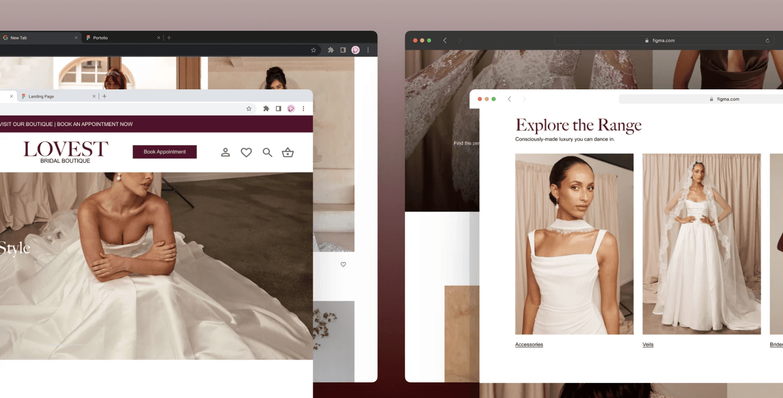
This project focused on designing a wedding shop website for a local wedding shop in Las Vegas, with more than 5 million weddings and counting, Las Vegas remains the undisputed wedding Capital of the word. There are more than 75 standalone chapels, plus dozens of hotel/resort venues. Las Vegas presents a unique wedding market that has inspired the growth of numerous wedding dress boutiques throughout the city. I’m partnering up with a local wedding shop lovest bridal boutique to upgrade their website for future use. The primary goal of this project was to design a user-friendly, user centered, visually elegant website. The website will mainly focus on information, online booking appointments, viewing collections not only as an e-commerce platform and to bring customers to the store for an in-store experience.
More projects


Research
For the research phase, I conducted a competitive analysis across three distinct market segments: a sustainability-focused
modern brand (Grace Loves Lace), a high-end boutique experience (Couture Bride), and a luxury designer bridal salon (Maiden White).

WEDDING
BOUTIQUE
A user-centered wedding boutique website that helps brides easily explore designer dresses, gain confidence through real bride inspiration, and seamlessly book in-store appointments.
To gather deeper insights, I conducted informal user interviews with individuals who were recently engaged or married. The discussion was structured around four key categories, with targeted questions designed to better understand their experiences and needs.
Background: Can you tell me a little bit about yourself? Would you like to share your current relationship status?
Shopping/browsing: what information is most impotent for you when visiting a wedding shop?
Appointment booking: have you booked an appointment online before? If so, is the experience easy or frustrating?
Visual experience: how important are real customer review for you? For example, bride photos galleries or reviews.
For user interview I have total of 4 participants (3 female 1 male, 2 engaged and 2 married) the goal is to understand browsing behavior, booking experience and emotional needs. From the interviews, it’s clear that wedding dress shopping feels exciting but also pretty overwhelming, especially at the beginning. People really look for clear visuals, real bride photos, and transparent pricing to help them decide, while cluttered pages and confusing navigation quickly frustrate them. Overall, a simple and easy experience—with intuitive browsing, a smooth booking process, and upfront information—helps reduce stress, build trust, and makes the whole journey feel more manageable.
Problem Statement 1- Overwhelm
Emily, a destination bride planning her Vegas wedding from out of state, struggle to narrow down dress options because bridal websites have too many choices without clear filtering, causing stress and overwhelm.
Problem Statement 2 – Need more Transparency
Emily needs transparent pricing and realistic dress gallery, but many bridal websites hide price ranges and rely heavily on model-only photography, reducing her confidence and trust before booking an appointment.
Problem Statement 3 – Booking Friction
Emily wants to confidently book an in-store appointment before flying to Vegas, but long complicated booking forms create friction and anxiety during the progress.
Keeping the information architecture and persona in mind, I mapped the user’s needs and goals into clear steps within the product. I focused on two key flows:
(1) booking an appointment and
(2) filtering by service type.
The booking flow follows a structured, linear path with branching based on service type (Made-to-Order, Same-Day, or Alterations), and concludes with a login or guest checkout and a final review step. Introducing service type selection early helps reduce cognitive load by guiding users away from irrelevant options later in the process.


Define
Based on the interview answers I came up with, the affinity map and from there we can see Reducing form fields could
see an immediate ROI.The Emotional Expectations cluster shows thinking about the vibe of the brand, not just the utility.
This is key for a luxury/lifestyle industry like bridal wear.
